Case Study: Clarity Solutions

Case Study: Clarity Solutions
Small town, big vision
revitilizing a local women’s health clinic
Clarity Solutions is a small women’s clinic making a difference in Elizabethtown, Kentucky. The came to us originally looking for simple website updates. After consulting with them, assessing their current assets, and gathering an understanding of their long-term goals, it became apparent that their current branding assets were not strong enough to carry them to their desired destination.
We pitched the concept of updating their outdated logo and providing them with a structured branding guide so anyone involved in their marketing efforts could be on the same page.
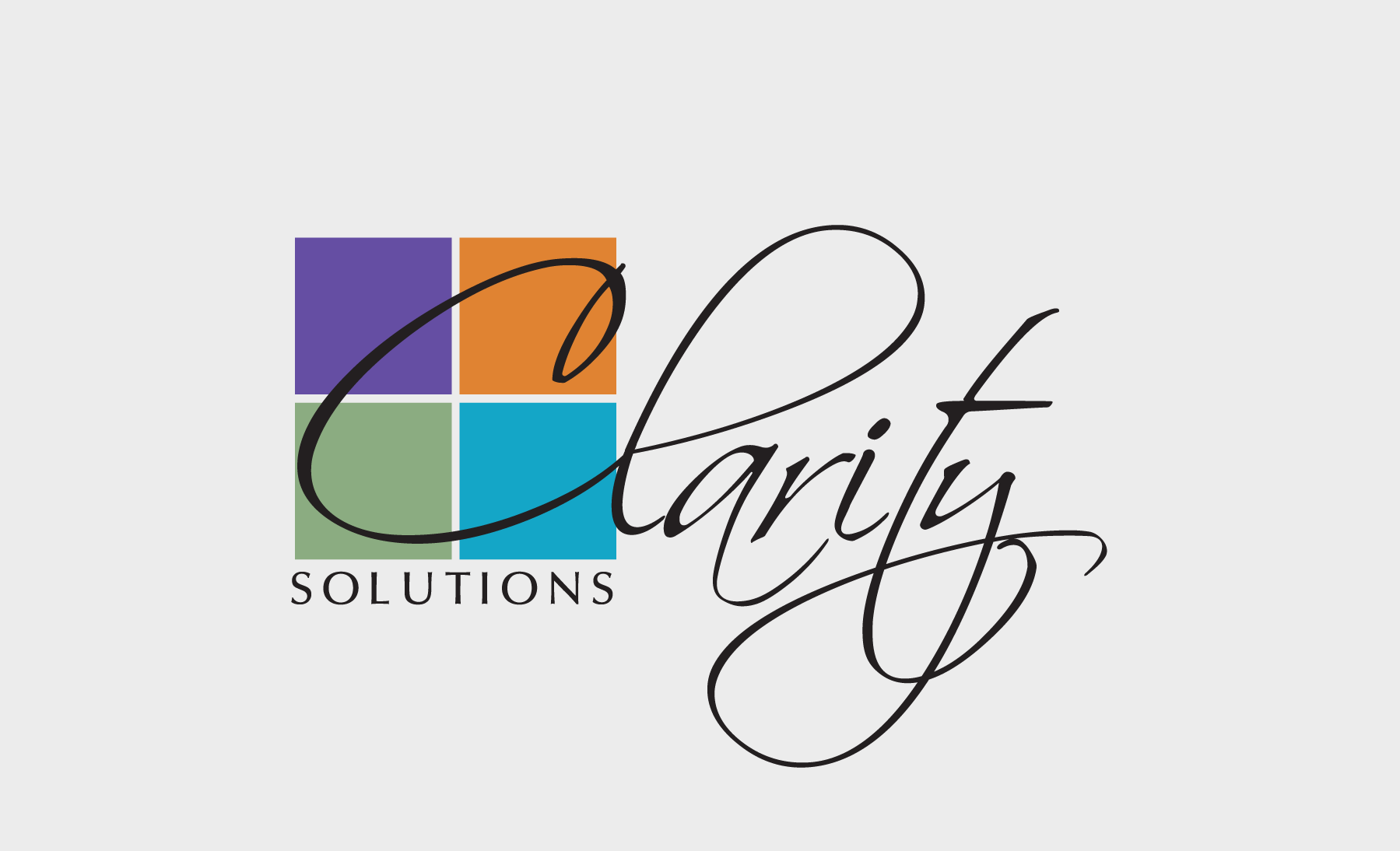
- Poor Scalability
“Solutions” is proportionally so small that it cannot be reproduced across a wide variety of production methods effectively without alteration (ie: embroidery). The thin, wispy loops of the “clarity” font are difficult to read at any scale, but especially scaled down – it also poses a potential problem for various types of production. Overall readability and reproduction ability is challenging. - No Color Flexibility
Being able to turn this logo into a 1-color print will prove to be ineffective. Design rules would have to break in order to achieve this, and it’s a sign of an unsuccessful logo. Logos should have the flexibility of being produced in 1-color, 2-color, to full color, depending on production method, usage, etc. See example below. There are also no Pantone colors assigned for consistent reproduction. - Dated
Outdated and commonly used fonts show the logo’s age and lack of quality. Taking the spirit of the logo and bringing it to modern day will help with overall appeal.
- Scalability
Opening up the logo allows for better visibility at different sizes, and poses less of an issue for reproduction. - Color Flexibility
Not having colors overlap allows for solid design rules to be applied in any color or layout situation without making exceptions to the rules. Pantone colors have been assigned for consistency. - Updated
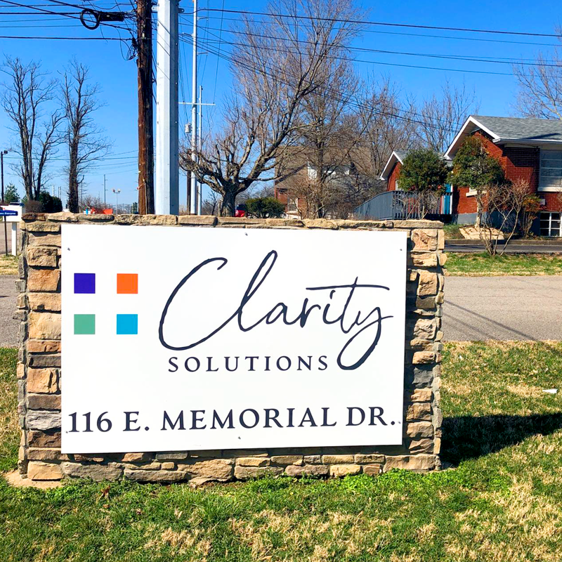
Classy, contemporary font choices help give this logo a face-lift. Opening up the four squares makes it not only breathable, but there’s a hidden “medical cross” in the negative space of the squares. It helps tie in the medical component of the company, while also giving the logo more clarity and airiness. - Standalone
The “standalone” icon should be simple enough to be used at nearly any scale, from website FAV icons (the small icon at the top of your browser tab), to large, impactful design elements.
Our work with Clarity Solutions spread to their sister companies, The Haven and Support Clairty, which encompassed further branding, designs, and website needs, each with their unique branding differences to set them apart as a separate service or to speak to a different audience.
- Poor Scalability
“Solutions” is proportionally so small that it cannot be reproduced across a wide variety of production methods effectively without alteration (ie: embroidery). The thin, wispy loops of the “clarity” font are difficult to read at any scale, but especially scaled down – it also poses a potential problem for various types of production. Overall readability and reproduction ability is challenging. - No Color Flexibility
Being able to turn this logo into a 1-color print will prove to be ineffective. Design rules would have to break in order to achieve this, and it’s a sign of an unsuccessful logo. Logos should have the flexibility of being produced in 1-color, 2-color, to full color, depending on production method, usage, etc. See example below. There are also no Pantone colors assigned for consistent reproduction. - Dated
Outdated and commonly used fonts show the logo’s age and lack of quality. Taking the spirit of the logo and bringing it to modern day will help with overall appeal.
- Scalability
Opening up the logo allows for better visibility at different sizes, and poses less of an issue for reproduction. - Color Flexibility
Not having colors overlap allows for solid design rules to be applied in any color or layout situation without making exceptions to the rules. Pantone colors have been assigned for consistency. - Updated
Classy, contemporary font choices help give this logo a face-lift. Opening up the four squares makes it not only breathable, but there’s a hidden “medical cross” in the negative space of the squares. It helps tie in the medical component of the company, while also giving the logo more clarity and airiness. - Standalone
The “standalone” icon should be simple enough to be used at nearly any scale, from website FAV icons (the small icon at the top of your browser tab), to large, impactful design elements.
Our work with Clarity Solutions spread to their sister companies, The Haven and Support Clairty, which encompassed further branding, designs, and website needs, each with their unique branding differences to set them apart as a separate service or to speak to a different audience.
Clarity of Vision
CONCEPTS AND GOALS
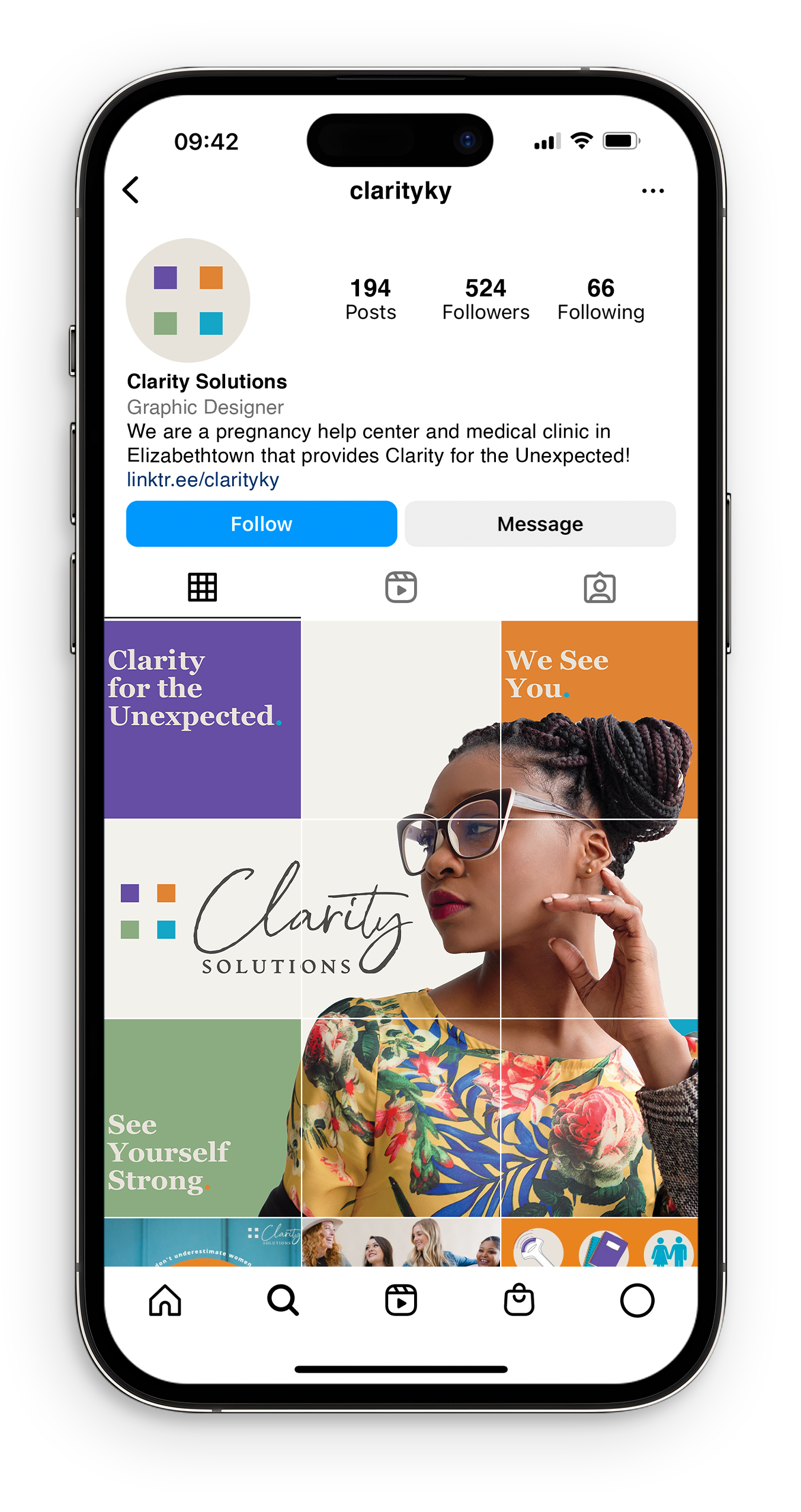
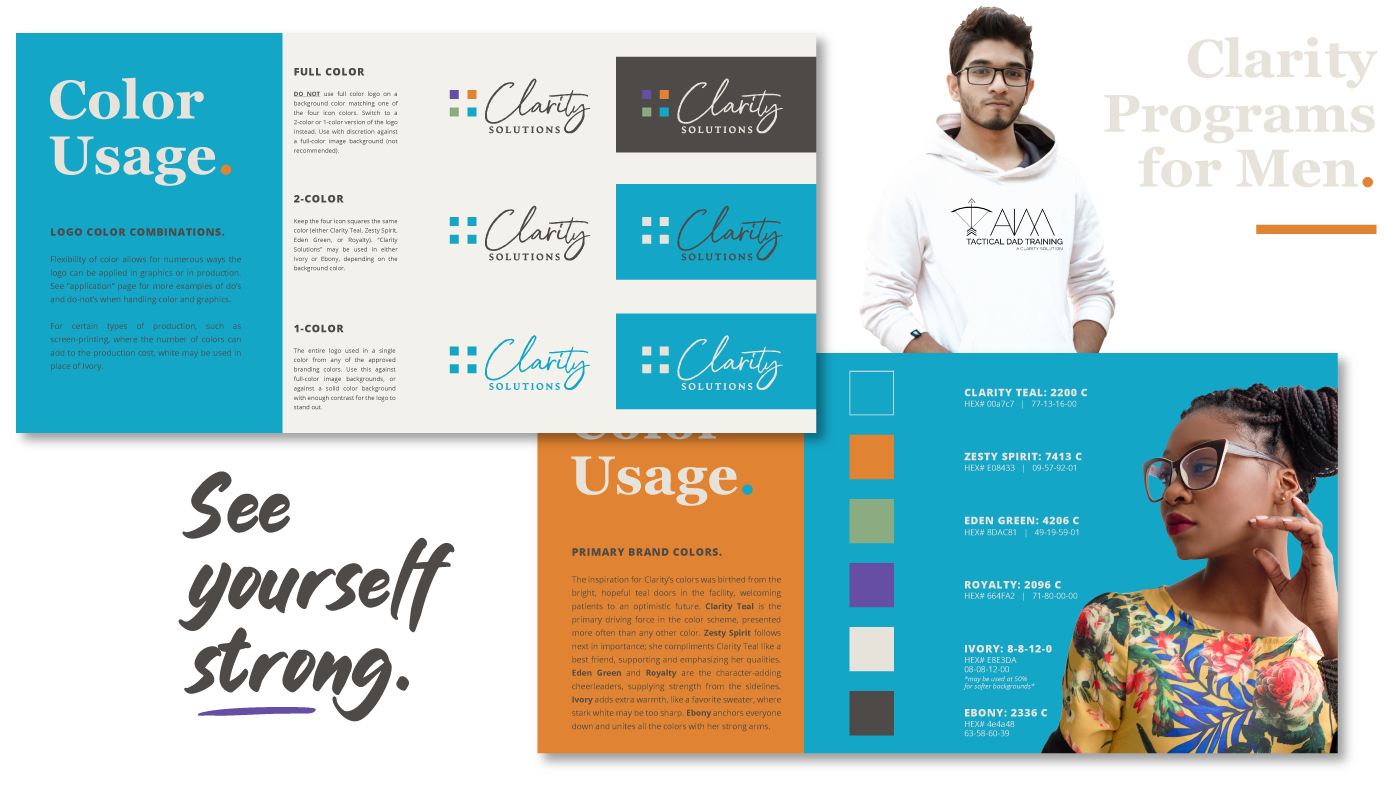
Our goal for the brand direction would be to soften the image by use of color, logo openness, and clear design rules and hierarchy. Making the brand feel warm and inviting will not only prevent it from feeling overly sterile as a medical office, but also give it a sense of maturity so as to not be too juvenile. A smart set of design rules will set the brand up for consistency and therefore a sense of trustworthiness, expectation, and reliability.
Our goal is to balance the appeal to women while also making it feel approachable to services for men. Earthy, script fonts with a natural, hand-written style evokes a personalized, humanistic, one-on-one feeling. Paired with complimenting, smart and mature fonts will help balance the style so as to not be too feminine.
Friendly, human, loving, smart, professional, reliable, relatable.
A website to draw audiences
EXECUTING THE BRAND PLAN
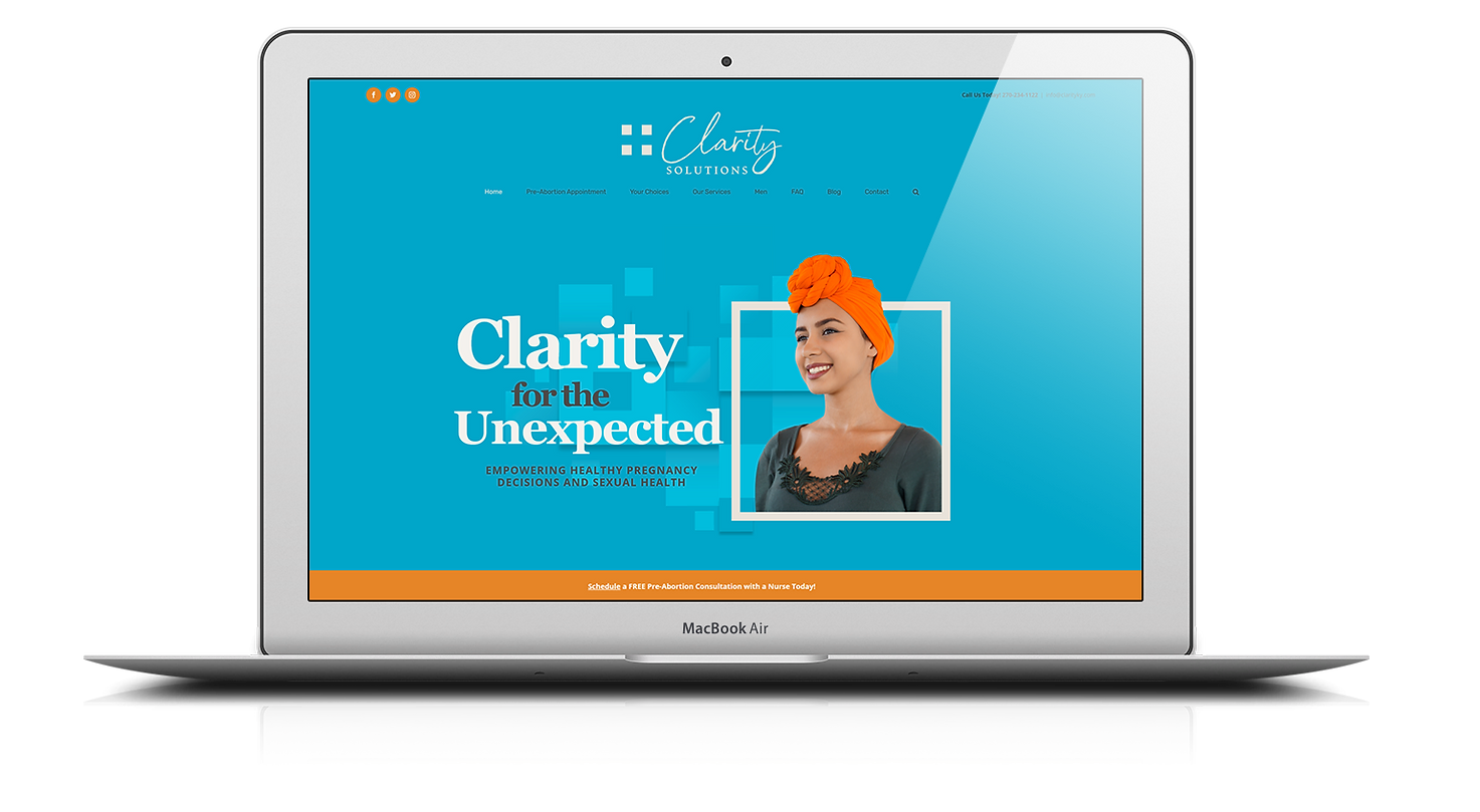
There are several factors that lead a company to needing a new website. Website hosting can be the first things to look into. Often times sourcing cheap hosting from a small company or individual results in negligent care, or the support to disappear when they mysteriously stop doing business. The second thing to consider is the platform where the site was built. There are several quick-fix, packaged solutions that lock companies into a tight-knit sandbox with little to no flexibility to build upon. Lastly, with no creative initiative, any site can fall flat without a visually driven team that knows how to apply brand standards and reach a target audience.
For Clarity Solutions, they’ve experienced all of these unfortunate trials that many other companies face. We freed them up with an open WordPress platform, keeping future growth in mind. Updates and changes are not hidden behind a corporate wall. Our design decisions for a fun and engaging site pulled from their newly updated branding guide which focuses on drawing the attention of their young adult target audience. Clarity immediately saw an increase in web traffic and contacts since the completion of their new site.
Print marketing & signage
projects for ANY BUDGET
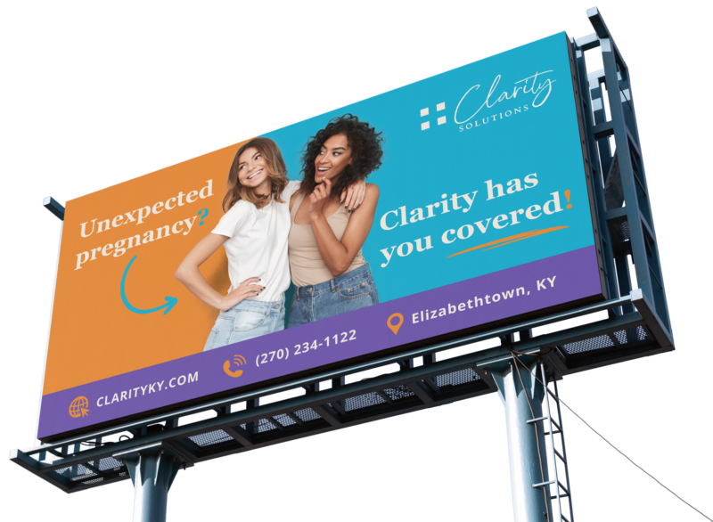
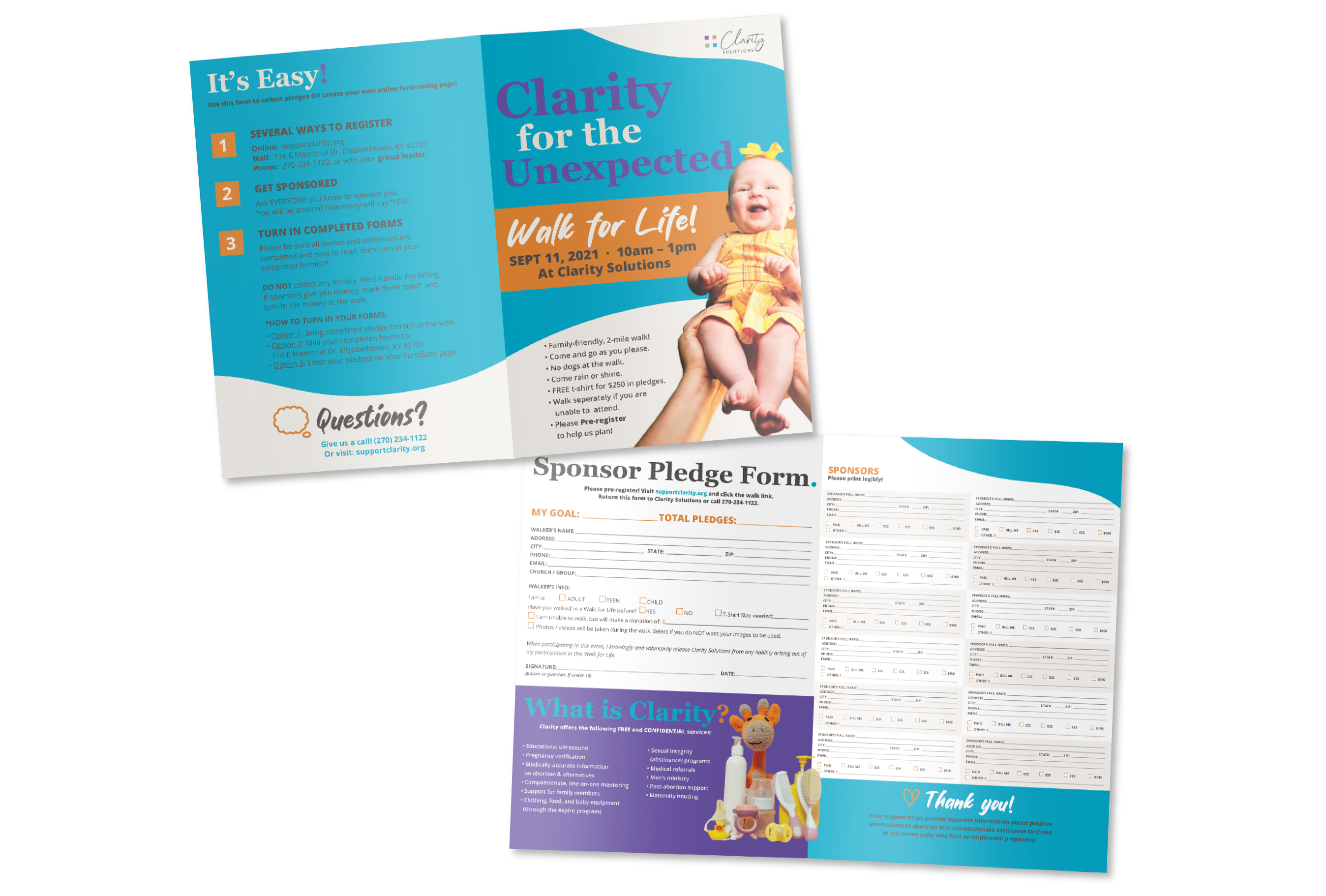
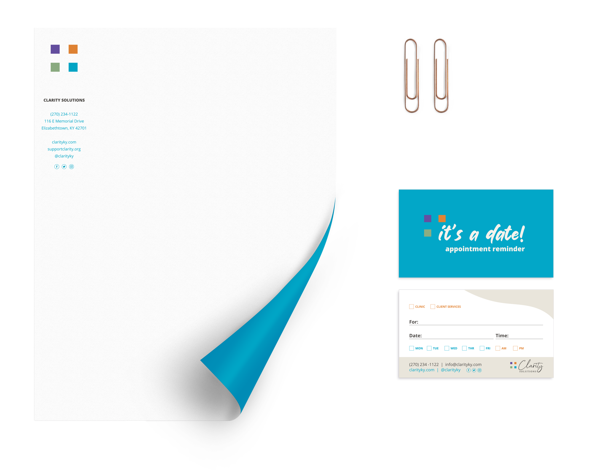
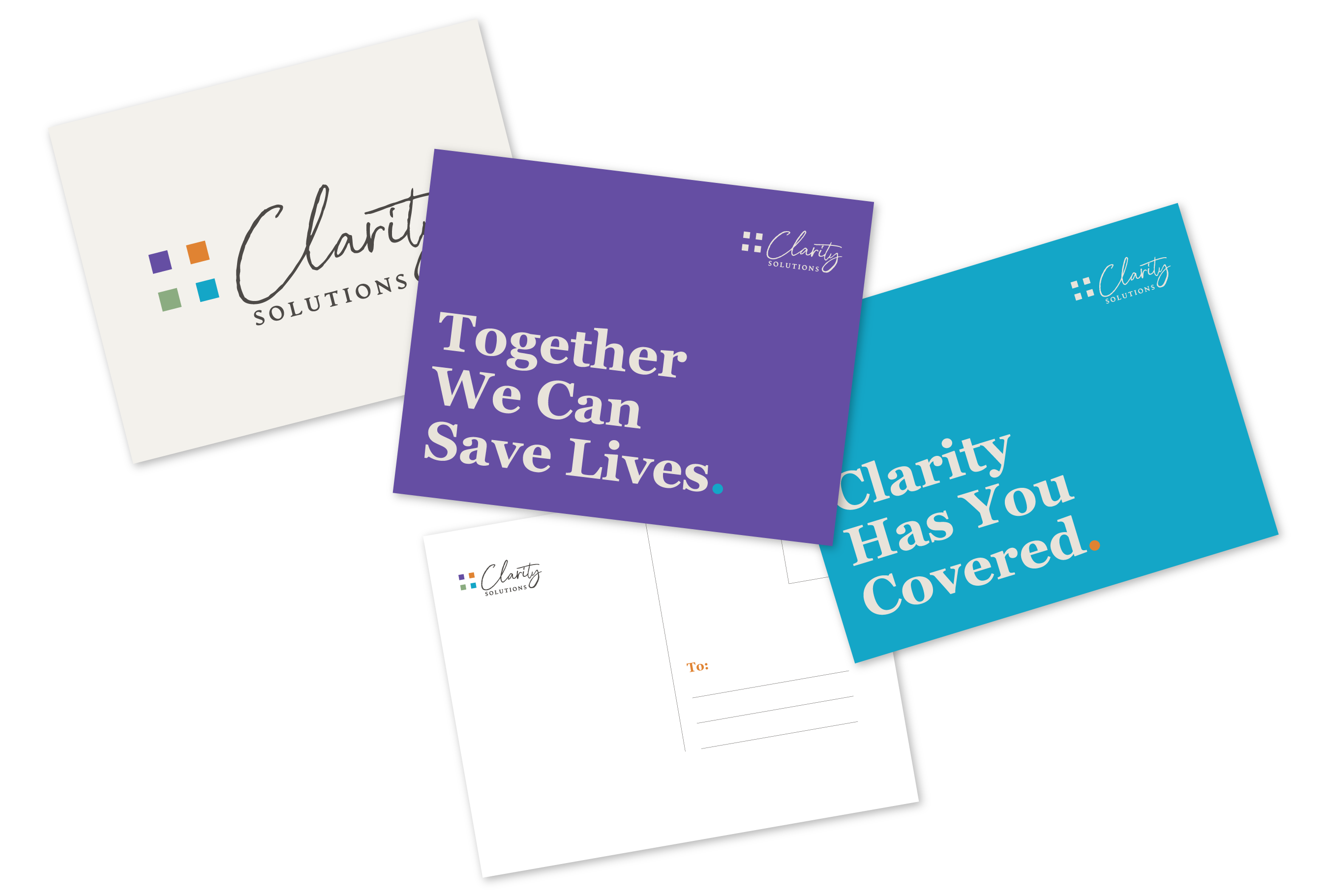
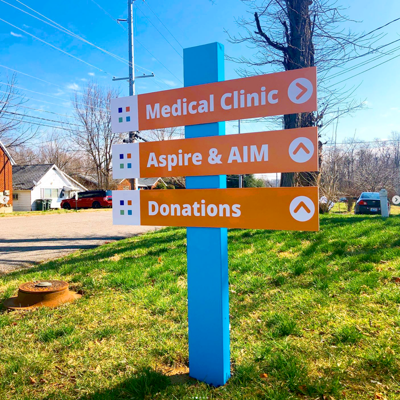
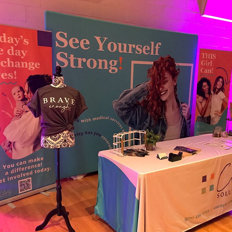
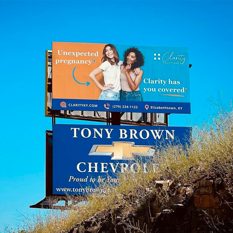
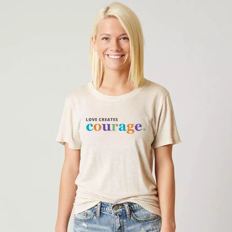
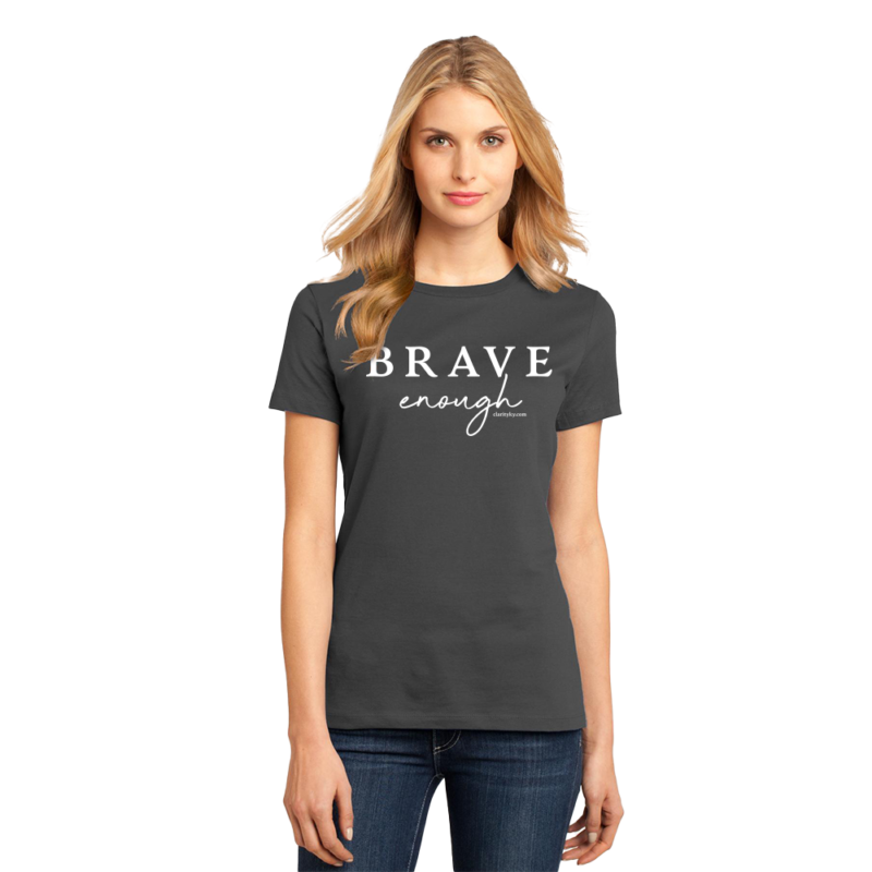
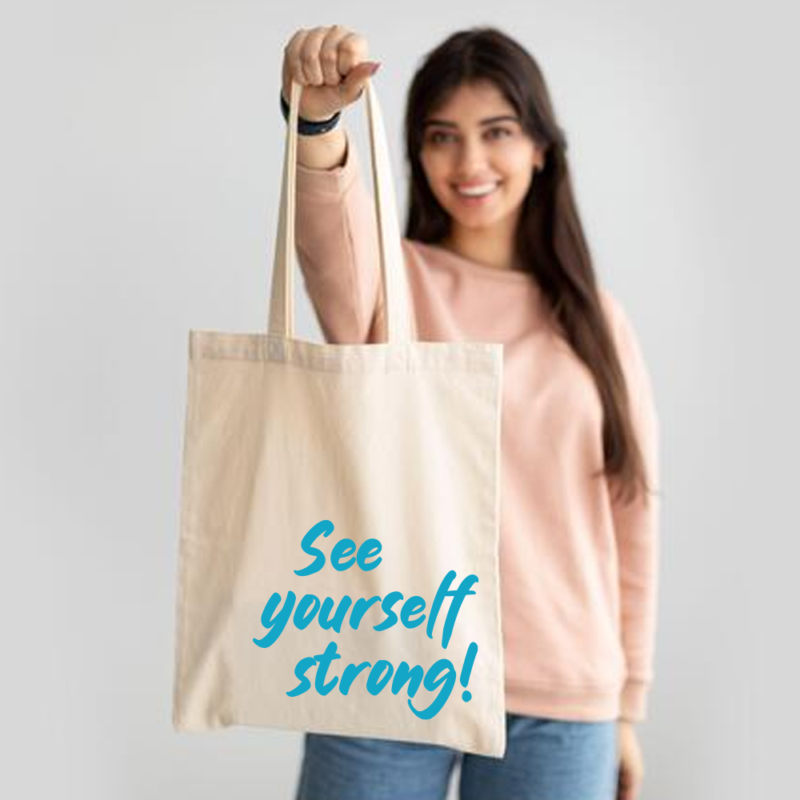
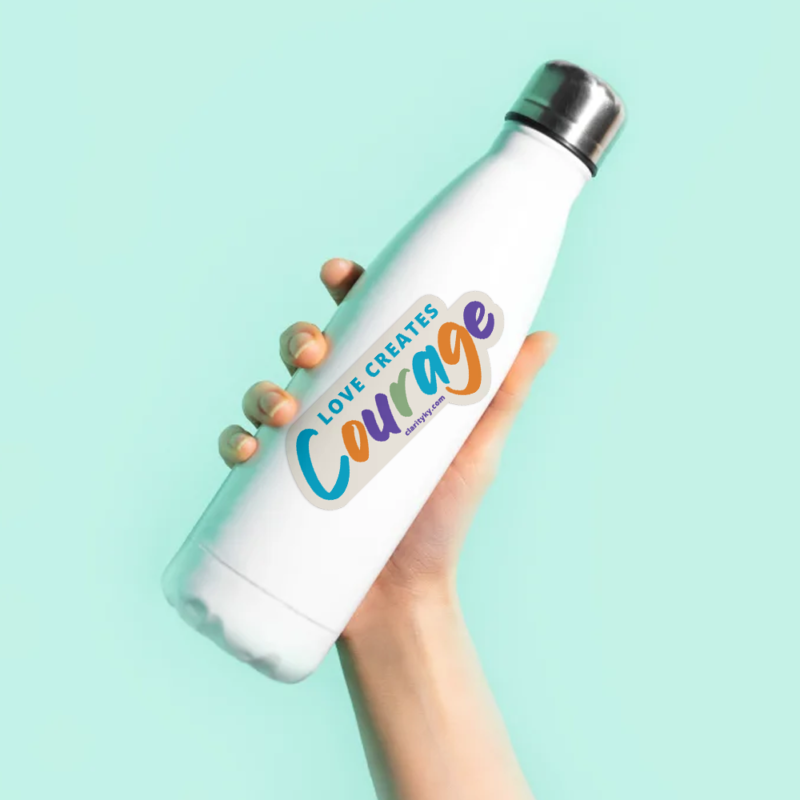
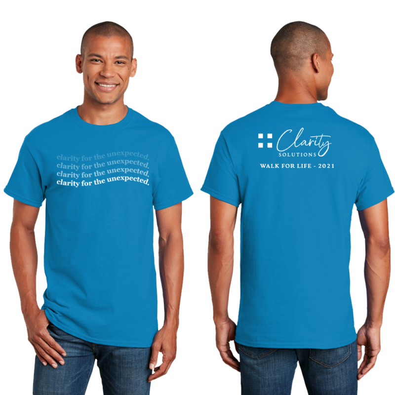
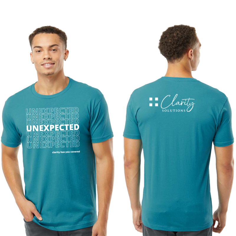
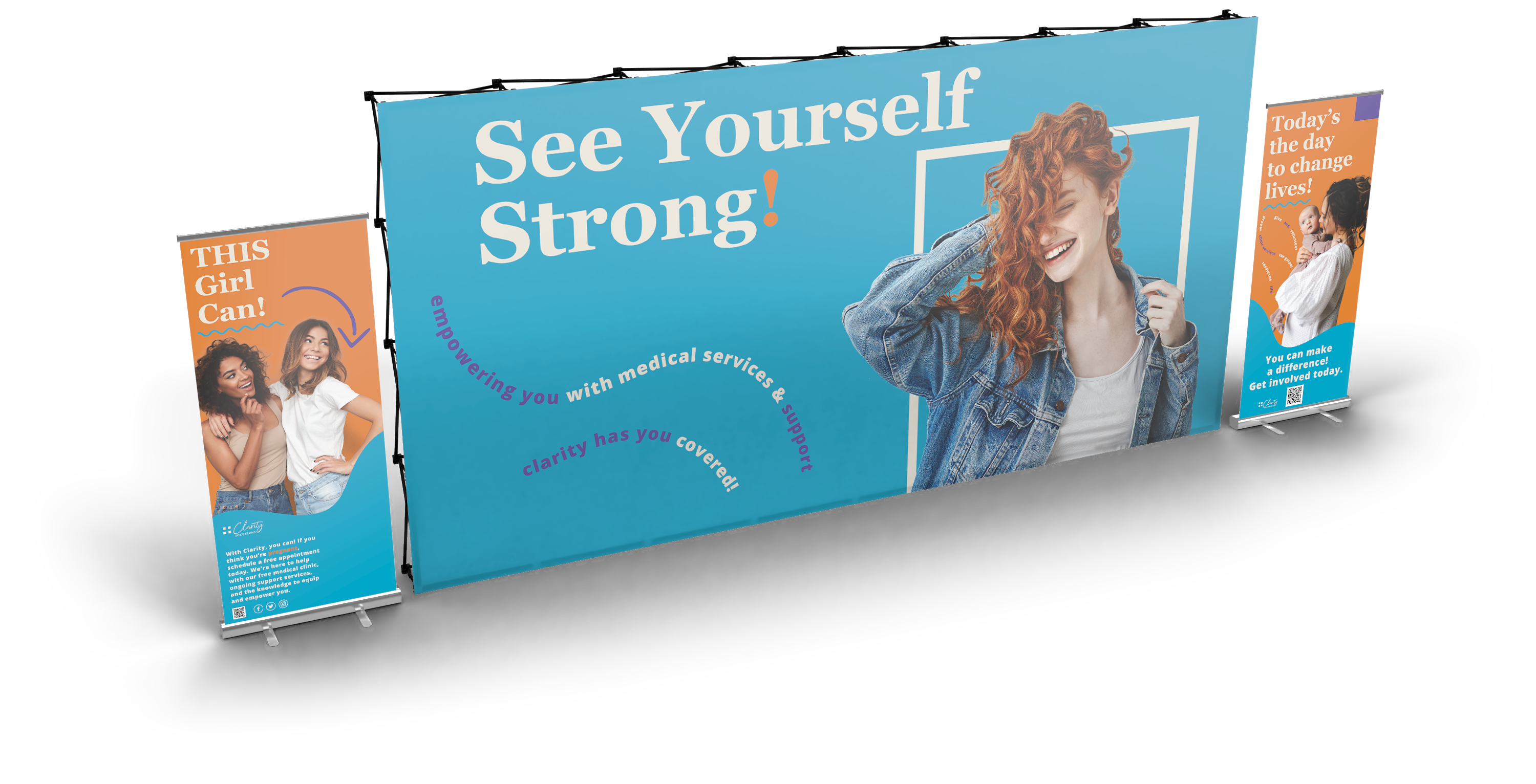
A lot can be accomplished on a budget with print marketing. We’ve helped Clarity Solutions with their print marketing efforts from small scale endeavors like postcard mailers, informative brochures, and corporate office identity literature, to full scale marketing campaign such as billboards, tradeshow booths, apparel & promotional product production, radio, and television spots.
Digital & Video marketing
videography, radio ads, mobile graphics
Clarity Solutions had the opportunity to expand their marketing efforts into the multi-media sphere. Our marketing campaign, “See Yourself Strong,” was implemented into video ads that aired in local TV commercials and theaters. We then made an audio version of that video for a local radio ad spot.
Our process began with a conversation about their goals and desired results. We then created storyboards to map out our proposed idea for the direction of their video. After the storyboard direction was approved, we recruited volunteer talent who were either employees, clients, or supporters. Voice-over talents were factored in and we worked with Clarity Solutions on constructing a clear and concise script. We shot on-site with use of camera and lighting equipment and worked off of a timed scheudle.
